

Case Study: Vudu Lists
Project
Lists are a feature on the digital video streaming service Vudu, a great way to organize your digital movie and TV collection.


Process

My Role
Product Design Director
Project
Organize Vudu video collections
Products
Vudu.com, mobile web, IOS app, Android app & living room apps
Team
Myself, Product Manager (1), Sr. UX Designers (2), UX Researcher (1) & Engineers (6)
Vudu users - XX million MAU’s
Skews male, 30-50yo, sci-fi, action, horror & tech
XX% own 50 or more movies, whales own 100+
Users struggle to find owned titles & need organization tools

Design a new product feature called “lists”

Research
Analytics
XX% revenue is derived from user’s w/ 100+ titles (whales)
UX Research
Heavy competitive analysis
Studied NPS, forums & social
Surveyed 600 whales
To understand needs & usage
Discovered the top reasons to organize:
Easily find title(s)
Create personal groups
Reduce clutter and look organized

My role: I directed our UX researcher in designing and executing the survey and helped present results to stakeholders.

Project Goals
After completing the research phase of the project, goals and requirements were defined.
Create a new organization feature on ALL of Vudu’s products including web, mobile, and living room apps..
Design UX for the following user stories:
As a Vudu customer who owns several movies, I want to customize groups of titles in the desired order so that my library is less cluttered and looks organized.
As a Vudu customer who owns several movies, I want to find a title in my library content more accessible and quicker so that my time spent searching for a film is minimized.
Design the following product features:
Allow users to create new, add to, rename, delete, and reorder lists.
Allow users to add, delete and reorder movie and TV shows to lists.

Ideation
We invited a small select group of designers, product managers, researchers and engineers to a whiteboard session.
My role: I led the brainstorm but took a step back to let the creative juices flow un-biasedly.

Design Challenges
This massive project encountered multiple hurdles, here’s a couple.
My role: Acting as a sounding board via quick ad-hoc design reviews, I helped guide our designers to keep them executing high quality with velocity.
Challenge #1 - Bulk Add (Web)
User needs an efficient way to add titles to a list in bulk, not simply one at a time.

Option A: Movie poster carousel
A title selection auto-appears in carousel.
Pros: Visually attractive, persistent on screen, and clearly shows the helpful poster.
Cons: The vertical scroll and scrollbar is awkward and the tray takes up a lot of real estate.

Option B: List sidebar
A title selection auto-appears in the list.
Pros: Simple, clean and persistent on screen
Cons: Text may truncate and does not indicate title as well as the movie poster. The image version shows very little posters on screen.

Option C: Accordion w/ thumbnails
Similar to “A” but area is expandable/collapsible.
Pros: Visually attractive, persistent on screen, and clearly shows the helpful poster.
Cons: The vertical scroll and scrollbar is awkward and the tray takes up a lot of real estate.

Option D: Text only confirmation, no additional visual confirmation.
Pros: Testing proved the additional visual verification of poster/text was not necessary. Overkill.
Cons: Tested to see if it’s too simple. It wasn’t but not all users notice the # change live. We could add an additional micro-animation to solve this.

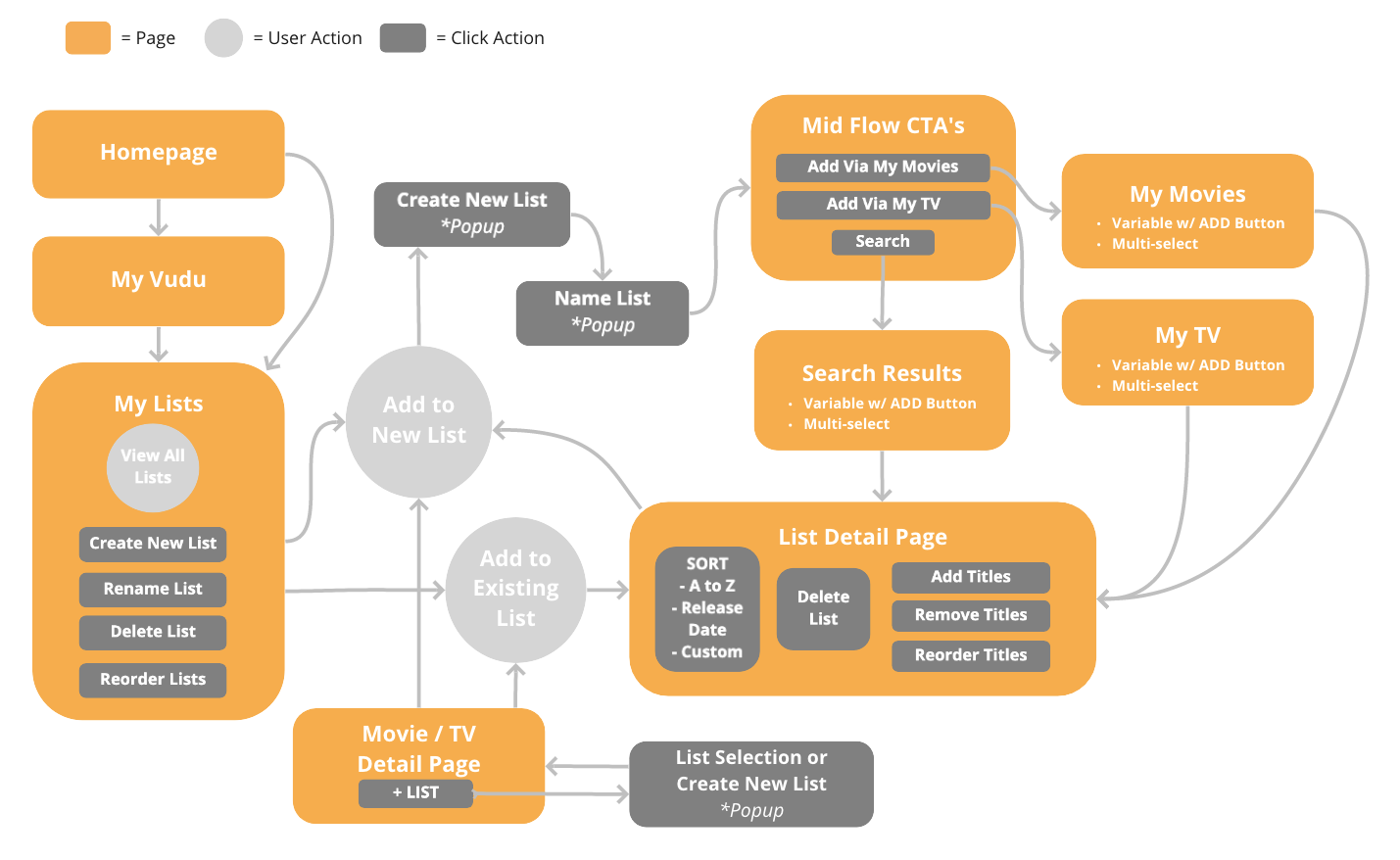
Challenge #2 - UX Flow (Web)
Product requirements dictated the user should be able to add, delete, reorder, and sort any content on Vudu. Therefore, it was challenging to nail down the flow to add/delete from several areas, including search results, my Vudu, product detail pages, and a newly designed mid-flow page. The mid-flow page definitely helped users create lists more intuitively and efficiently, educating them that items can be added from my movies, my TV and search.
Challenge #3 - Reordering
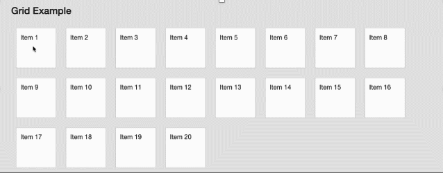
Real-time sorting via the mouse or finger input on web and mobile apps added interactivity and delightful UX to the experience. There were several ways to achieve this, with the list option providing a clean, simple view but came with issues of text truncation, possible confusion with movie titles being too similar and hard to read, and moving the item at the bottom of the list to the top - lots of up/down scrolling. The poster grid was slightly more intuitive, came with a larger tap/click target to move items around easier. With some quick UX research and testing, the poster grid proved more likable.


Challenge #4 - Design Patterns
In some cases, the simplest of design tasks can be challenging. In this situation, the design patterns themselves provided a healthy debate about which is more on brand, indicative of selection, and have an easy click target.

Final Design - Web Desktop
Click the play button to view the final desktop UX experience, accompanied by my cheesy narration.
Summary
UX Research
Rave reviews from users, press, forums, social media & surveys
Sent a post-launch survey to 5K list makers to gain intelligence around the following:
Awareness
Satisfied or not & why
New feature priorities
First Week Analytics
Huge adoption
XXX,XXX accounts used the listing feature
X,XXX titles added to lists
Design Patent
We filed one design patent for the card pattern showing three thumbnails indicating the top 3 items in the list.


Final Thought - My Favorite List
In closing, here's a fun list to put a smile on your face.
The Vudu user base's top types of lists created include Disney, Marvel, Kids, Watch Next, and Star Wars. Logically, the popularity and their creation made sense. However, this first list I created once the app was fully functional is hands-down, my favorite.
