

App Critique: Surfline
To better understand my design thinking as it applies to product design reviews, here is a walk-through analysis of an app's design choices. What is great about the app, and where are the problems.
The chosen app is Surfline, available on Android & IOS with free and paid versions. Significantly relevant for the surfing community, it provides users access to the largest network of live surf cams, surf reports, swell analysis & weather forecasts for favorite surf spots.
The primary user base is surfers of all skill levels, including new surfers, a prominent acquisition segment, and point that I will address later, where Surfline could improve their app user experience.


For pros like 11X world champ Kelly Slater.
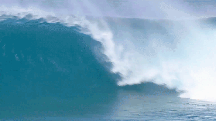
For beginners like my friend Bob.


Research
Personal Critique
I have personal opinions about the UX and a hypothesis that the store ratings are inflated. So, I gathered my own data to validate or discount my views and get detailed user feedback by sending out a Net Promoter Score (NPS) survey to 30 surfer friends.
App Store Reviews (Apple)

App Store Ratings (Apple)
4.7 of 5 Stars
10K Ratings
NPS / User Survey

Likes
I use the app but I don't want to pay for it. It has really cool surf information. Everything you need to know before you go. Swell, size, temp, etc.
The app is easy to signup for, easy to use and easy to find my local surf spot. The video and the surf report is AWESOMMMMMMMMMEEEE!
The app is well done. I like the well written, detailed and accurate surf reports and mostly accurate forecasts. There is a ton of valuable information and available worldwide for tons of surf spots.
The report is usually spot on accurate. I like the video camera footage and features. I use Surfline every week.
I get a good sense of what the value prop of the app is just by its name even before downloading the app- "Condition" blue tags on the spots are helpful to make a quick decision - After I select a spot, lots of info all aggregated for me for free! - The live cam is super helpful to get a sense of how crowded the beach is -- helpful during this COVID situation. - The app is focused and streamlined to help the user achieve their main goal of deciding whether a spot is favorable or not.
My favorite part of the app was the detailed amount of information of realistically and good amount of surfing spots around the globe. Really enjoyed that it gave broken down details of tides, times, winds, temperatures, etc. Making it easier to plan a potential outing and picking the right time to go to surf. On top of the the beaches which had video camera views of the live beach made it even better, I almost wish there was video of every single beach because it really gives you a live view of the day is looking and the amount of people. I also appreciated the customized view of my favorite beaches making it easy or really find the one you like and that was very intuitive.
I love the option to explore surf spots up and down the Cali coast. The Cam footage inspires me to action and the days stats of knowing the wave size and conditions is like a gift from above. The alerts feature is modern magic.
I like how all the information is laid out on one page and especially the initial summary written by a real person.
Dislikes
Ads are annoying. And because I don't pay, the forecast is only 1 day instead of the week which is also super annoying. Please tell the maker to fix this.
Ads. The ads suck.
The app still shows me ads, even though I pay. Shouldn't it not show ads????
First-time use > Location > After being asked for Location when I first logged in, expected home screen to populate with spots around me. But that wasn't the case. Home screen was empty, which forced me to do more work (add favorites) in order to start using the app. Also, missed opportunity to showcase "trending" spots or local spots with "good" conditions. - Adding Spots > Again, expected to see spots based on my "current location". But it forced me to first selected a continent, country, state, city, and then beaches. Too much work. - After adding spots> On the screen "Favorites":Page has ads at the top and bottom, which makes it look busy.Some spots do not have "condition" tags on them, which makes it difficult to assess whether they're a good place to surf. - Camera: Ads every time camera refreshes. It's too much!
The amount of ads was dislikable even if they were semi discreet. I played videos of different spots and I got the same ad over and over again which was a great themed ad but if you are exploring the app it gets old fast, just like the static ads around the detail pages. That made me think that maybe some of this hustle would go away by upgrading to premium specially if I use the app often.
As a beginner, I wouldn't understand the graph/bar of Swell info and Wind info. Would be cool to have a social feature aspect to it. Like beginner surfers group to support, give tips, and what to look out for.
The visual hierarchy could be improved as every section sort of blends into one another.
Visual not good. Feels complicate. Bad onboarding.
The sign up process feels a bit pushy. They should have kept the signup process to later down the interaction experience.
Disclaimer
To be fair to Surfline, my NPS survey sample size was too small, although it still produced some excellent findings. Running a real-world NPS survey would require 250 minimum participants, not 13. To obtain this recommended sample size, assuming a reasonable response rate of 5-10%, I should have emailed 2500-5000 real-world app downloaders.
PROS - What Works
Overall the app is well designed, abundant with cool features, content-rich, and technically sound. Here are a few highlights.

Live Cameras
The live HD video UX is AMAZING
Logically stacking data w/ video first, as it’s the most popular feature, is a smart information architecture (IA) design choice
Icons for angles, rewind, share, cast & full screen are intuitive
Turning the phone to landscape view nicely enters full-screen mode, and when here, tapping the screen brings up several quick-access important functions


Path to Subscription
At the top of the paying user acquisition funnel is a well-designed marketing landing page with a “soft sell” call to action (CTA) to fuel the funnel
Engaging value propositions
The signup flow after this page is effective, but not excellent, it has room for improvement by cutting down steps and optimizing copy

Personalization UX
There is an intuitive onboarding flow to personalize the app by adding your favorite surf spots
The search and search results UX is effective
The design pattern highlight, color, and star icon along with the click target area being the entire thumbnail, not just the small star, is a wise design choice

Explore
Using Google map integration is a good design choice enabling a familiar and easy scroll, pinch, zoom, and tap UX
Excellent UX is featured with real-time updates to the map when scrolling the list and to the list when browsing the map
Icons are appropriately placed and understandable for current & favorite locations

Information Architecture (IA)
IA hierarchy is logically stacked, the most important and useful data is at the top of the page, least important at the bottom
Location
Live Cam
Surf Quality
Surf Height
Tide
Wind
Weather …

Quality Indication by Color
The #1 question asked, “is the surf sizeable and rideable” and users can quickly get answers with the green color highlights, meaning yes, it’s fair to good
Colors are featured in multiple, logical locations in the UX
CONS - Opportunities for Improvement
Neglecting user experience translates to lost opportunities in both retention and acquisition or, worse, could facilitate negative product reviews.
Intimidating
The data is overwhelming. It’s complicated to understand, comes with a significant learning curve, and there is no life raft for newbies to help know what is going on. Here lies a HUGE OPPORTUNITY for Surfline to not alienate the beginner user base with several solutions
Profiles
Advanced vs. basic options
Tooltips, help, video tutorials or other education
The colors, layout & charts are chaotic and could benefit from simplifying

Is Free Worth It?
Commentary from the app store and my NPS survey validated the fact that the free version of the app feels more like a barely usable tease versus the pay version
The free version punishes users with overwhelming ads, locked places, no reviews, quality downgrade & 1-day forecast vs. 7
Psychology of the endowment effect states that “users value it more if they own a part of the app vs. owning nothing at all,” and in the Surfline case, it feels like they own “close to nothing”
The ad UX is awful; it’s excessive in both quantity & length


Quick Info Fast
The list is an older design pattern that could use a redesign with more modern cards, swipe scrolling UX, etc.
I question the information architecture and if some of the tier 2 meta data not shown here should actually tier 1 and shown
Shown: Location, size, quality. Not shown : Swell, tide, wind, temp & water temp
The stock photo image used behind the data is misleading and shows great surf conditions when in reality it could be terrible, meaning the app could benefit from showing a live feed image capture

Web on Mobile
The app features embedded news published from their website; however when it renders in the mobile app, the user can be trapped, and layout styles are broken
All pages should be tested by QA and UX to be mobile friendly


Conclusion
Awesome features, information and effective UX
It’s a well designed app, quite possibly not worthy of 4.5 of 5 stars; thus I’d be curious what their real-world Net Promoter Score (NPS) and user comments are
Surfline should consider ALL user types and solve the beginner and learner alienation issue by integrating one or all of the following: profiles, advanced vs. basic options, tooltips, help, and education
The user interface and design (UI) could be updated as it has information overload, dated design patterns, and excessive use of colors